Selecting an interior color palette is one of the most influential design decisions a homeowner can make. In San Francisco, where housing stock ranges from classic Victorians to mid-century residences and modern condominiums, color choices play a critical role in maintaining architectural integrity and long-term appeal. Timeless interior color palettes support both everyday living and resale value, an important consideration in San Francisco, CA, real estate. Below is a practical guide to color approaches that have proven to work well across neighborhoods and property types.
Understanding San Francisco’s Design Context
San Francisco homes are influenced by their surroundings, climate, and architectural history. Natural light can vary widely due to fog, narrow lots, and hillside construction. As a result, interior colors need to perform well in both bright and low-light conditions.
Neutral foundations remain popular because they adapt to changing furnishings and artwork. However, neutral does not mean flat or monotonous. Successful palettes often combine soft contrasts, warm undertones, and subtle variation to add depth without overwhelming a space.
A timeless approach considers the structure of the home first, then uses color to support it rather than compete with it.
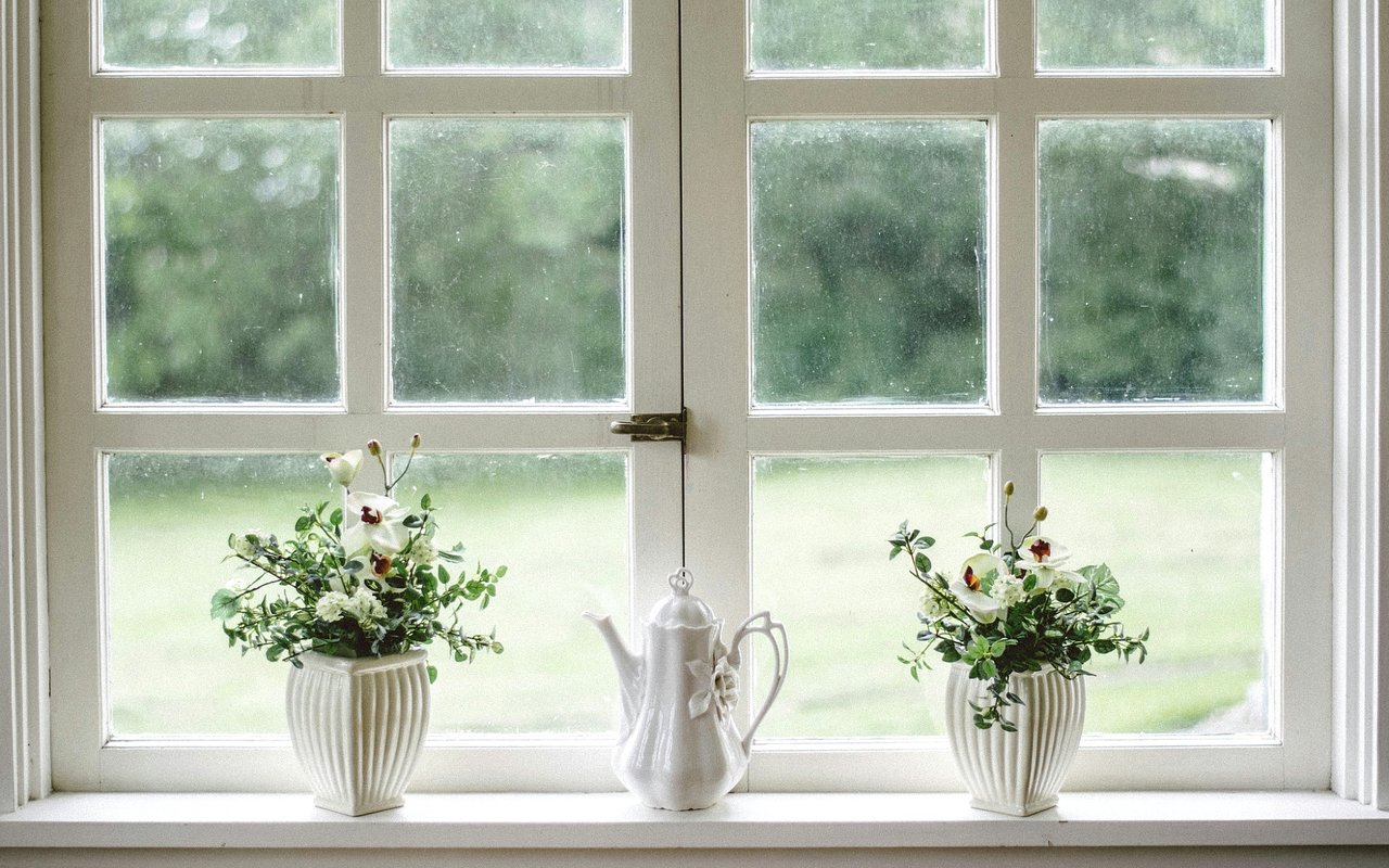
Soft Whites and Warm Off-Whites
White interiors have long been associated with San Francisco homes, particularly in properties with period detailing. The key to longevity is selecting whites with warmth rather than stark brightness.
Warm off-whites work well with original wood floors, decorative molding, and plaster walls. They reflect available light without appearing harsh and provide a flexible backdrop for both traditional and contemporary furnishings.
These shades are commonly used in living areas, hallways, and kitchens, where they help spaces feel cohesive. In the context of San Francisco, CA real estate, warm whites are also appealing to buyers because they photograph well and allow for easy personalization.
Neutral Grays with Balanced Undertones
Gray continues to be relevant when chosen carefully. Timeless gray palettes avoid extremes and focus on mid-range tones with balanced undertones.
In San Francisco homes, grays with subtle warmth tend to perform better than cool, blue-based options, particularly in fog-prone neighborhoods. These shades work well in bedrooms, offices, and open-plan living spaces, offering a clean look without feeling cold.
Gray is often paired with natural materials such as stone, wood, and metal, reinforcing its role as a supporting color rather than a focal point.
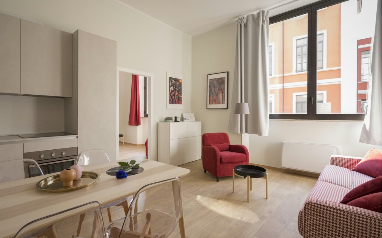
Beige and Gray for Transitional Spaces
Beige has returned in more refined forms, often blended with gray to create “greige” tones. These colors bridge traditional and modern design, making them suitable for a wide range of home design styles in San Francisco.
Greige palettes work especially well in homes that combine historic elements with updated finishes. They provide warmth while maintaining a neutral appearance, making them a practical choice for main living areas and primary bedrooms.
From a market perspective, these shades are often viewed as safe and adaptable, which can be beneficial when preparing a home for sale.
Muted Earth Tones Inspired by the Bay Area
Earth-toned palettes have strong ties to the natural environment of Northern California. When muted and used selectively, these colors feel grounded and enduring.
Soft taupes, clay-inspired hues, and subdued greens are frequently used in dining rooms, libraries, and accent walls. These tones complement wood cabinetry, stone surfaces, and older architectural details without dominating the space.
Rather than using bold saturation, timeless applications rely on restraint. Earth tones are most effective when balanced with lighter neutrals and consistent finishes throughout the home.
Subtle Blues for Calm and Continuity
Blue has a long history in coastal design, but timeless San Francisco interiors favor muted versions over bright or trendy shades.
Soft slate blues, gray-blues, and washed navy tones work well in bedrooms and bathrooms, where a sense of calm is often desired. These colors pair effectively with white trim, natural stone, and brushed metal fixtures.
Used sparingly, blue can add variation to a neutral palette without feeling dated. It is often most successful when limited to specific rooms rather than applied throughout an entire home.
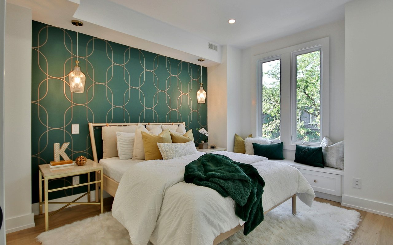
Using Contrast Without Overstatement
Contrast is essential for visual interest, but timeless interiors avoid sharp or dramatic shifts. Instead, contrast is introduced through finishes, textures, and tonal variation.
For example, pairing off-white walls with slightly darker trim, or using deeper cabinetry against lighter walls, creates definition without overwhelming the space. This approach respects the home's architectural lines and maintains flexibility over time.
In competitive San Francisco, CA real estate markets, homes that demonstrate thoughtful contrast often feel more considered and move-in ready.
Color Consistency Across the Home
One of the most overlooked aspects of timeless design is continuity. Successful palettes typically use a limited range of colors that flow from room to room.
This does not mean every space must look the same. Instead, variations in tone and application create distinction while maintaining a cohesive overall feel. Consistency is particularly important in open layouts and multi-level homes, which are common throughout San Francisco.
A unified palette also simplifies future updates, allowing homeowners to refresh furnishings without revisiting major paint decisions.
Timeless Palettes and Long-Term Value
Interior color choices directly influence how a home is perceived by buyers, appraisers, and agents. Neutral, well-balanced palettes tend to support broader appeal and reduce the need for immediate updates.
For homeowners considering a sale, reviewing color choices through the lens of San Francisco, CA, real estate can be especially helpful. Timeless palettes often shorten time on market and allow buyers to focus on layout, location, and condition rather than cosmetic changes.
Even for those not planning to sell, these palettes provide stability and flexibility as needs evolve.
A Practical Approach to Color Selection
Choosing a timeless palette does not require avoiding personality. Instead, it involves anchoring the home with dependable base colors and layering character through art, textiles, and furnishings.
Homeowners are often best served by testing colors in different lighting conditions and considering how spaces are used throughout the day. Consulting with design and real estate professionals can also provide a valuable perspective on what works well locally and what holds value over time.
Homeowners are often best served by testing colors in different lighting conditions and considering how spaces are used throughout the day. Consulting with design and real estate professionals can also provide a valuable perspective on what works well locally and what holds value over time.
About The Warrin Team
The Warrin Team is widely recognized for a measured approach that emphasizes privacy, high standards, and attentive service. Their work centers on representing buyers and sellers of premier homes throughout Marin County and select luxury properties across the San Francisco Bay Area.
Drawing on detailed knowledge of neighborhood trends and property values, the team delivers tailored guidance rather than one-size-fits-all solutions. Their focus on individualized client needs has positioned them as a trusted resource for distinctive listings in Marin County and surrounding markets.
From waterfront properties in Tiburon to historically significant residences in Pacific Heights and private estates in Kentfield, the Warrin Team applies local expertise to match clients with homes that align with their priorities across Marin County and the greater Bay Area.
If you're looking to buy or sell a home or have any questions about the San Francisco, CA real estate market, contact The Warrin Team today.